HOW TO GRAPH
Principles | Components | Graph Selection
SIMPLE BAR GRAPHS EXPLAINED
Let us think about simple bar graphs as either being arranged horizontally or vertically. Despite their different spatial orientations, however, at least one defining characteristic remains the same: on the ‘primary’ axis–the x-axis on a horizontal bar graph and the y-axis on a vertical bar graph–bar graphs typically display a variable that is considered qualitative or categorical (e.g., red, green, blue OR Swiss, Italians, Americans, Germans). This is different from histograms, which typically display a variable on the x-axis that is considered quantitative or numerical (e.g., 10, 20, 30, 40).
EXAMPLES
Here are two examples of well-constructed simple vertical bar graphs:
Example 1

Example 2

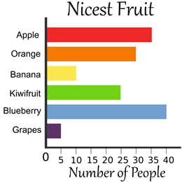
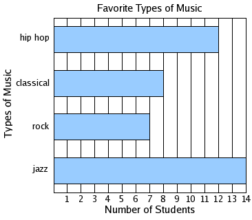
And here are two examples of well-constructed simple horizontal bar graphs:
Example 1

Example 2

TUTORIALS
YOUTUBE’S Dan Calder
[youtube https://www.youtube.com/watch?v=7mKzTBYufaQ&w=560&h=315]
YOUTUBE’S eHowFamily
[youtube https://www.youtube.com/watch?v=0q_9VmQZumI&w=560&h=315]
YOUTUBE’S Todd Nickle, who will show you how to make a bar graph in Excel (Mac 2011).
[youtube https://www.youtube.com/watch?v=opl1xnC6cCI&w=560&h=315]
GRADING RUBRIC
Click HERE to see the grading rubric Dr. Merritt uses to assess the simple bar graphs you create in his science classes.
MORE RESOURCES for STUDENTS
For a description of the different types of bar graphs followed with examples that illustrate when to use them, use THIS link.
To see a handout that describes how (and when) to make bar charts/graphs, click HERE.
Also, Gary Klass, upon whose ideas many of Dr. Merritt’s ‘How To Graph’ pages are built, offers some rules for making simple bar charts.
Klass’s Rules for SIMPLE BAR CHARTS
| 1. Minimize the ink, do not use 3-D effects. |
| 2. Sort the data on the most significant variable. |
| 3. Use rotated (horizontal) bar charts if there are more than 8 to 10 categories. |
| 4. Place legends inside or below the plotted area. |
| 5. With more than one data series, beware of scaling distortions. |
Pie charts | Simple bar graphs | Histograms | Line graphs | Scatter plots
Stacked Charts | Boxplots | Sparklines | Kite diagrams